Following on from the Pure CSS tabs post, it seemed like a reasonable option to post code for a more traditional CSS/JavaScript type tabbed dialog. The code assumes some level of understanding with CSS/HTML/JavaScript.
So without further ado, let’s get into the code. (or click here for demo)
<div class="container">
First we create a container to hold the rest of the elements within. This will allow us to style and control the dialog. As follows:
.container{
	position: relative;
	left: calc(50% - 250px);
	bottom: calc(50% - 150px);
	width: 500px;
	height: 300px;
	background-color: #aaaaaa;
	border: 2px solid #888888;
	padding: 20px;
	text-align: left;
}
Here we are positioning the dialog relatively to allow us to place it in the middle of the screen. We also set the width and height which can then be used in our positioning calculations for left and bottom. We want it half way across the screen minus half the width of the dialog and half way down the screen minus half the height of the dialog. We set an overall background colour and padding of 20 pixels between the edge of the dialog and the child elements. Set a coloured border and align all the text within this parent element to the left. Next we add an optional line. This simply draws a cross in the top right corner of the dialog which you can put your own code in to act when it’s clicked.
<span class="close" onclick='YourCodeHere;'>×</span>
You may want to use this dialog whereby a user clicks a button to show it, in which case you would put code behind the “X” to close (hide) the dialog when clicked. If you don’t want the “X” on the dialog, just delete this line from the full code. Now let’s add the buttons which will become our tabs:
<button class = "btab btab0" onclick="showText(0)">Tab1</button>
<button class = "btab btab1" onclick="showText(1)">Tab2</button>
<button class = "btab btab2" onclick="showText(2)">Tab3</button>
<button class = "btab btab3" onclick="showText(3)">Tab4</button>
You notice the onclick event has been specified to call a function called “showText” passing the tab number to that function. This will allow us to show the correct tab panel for that button (tab) at the correct time. Now to style the buttons to look more like tabs:
.btab{
	width: 90px;
	height: 40px;
	border-left: 1px;
	border-right: 1px;
	border-top: 1px;
	border-bottom: 0;
	border-radius: 15px 15px 0 0;
	border-style: solid;
}
This is simply a case of adding a border to the top and sides, with rounded corners, and specifying the height and width of our tabs. We also want the curser to change to a pointer when hovering over the tabs (buttons).
.close:hover{
	cursor: pointer;
}
In chrome, when the focus is set to one of our tabs, it will draw a unwanted rectangle on the tab. We can, however, remove this using style.
.btab:focus{
	outline: none;
}
With that taken care of we can now add our code for the actual tab content.
<div class="tab0 tab">
	<p>
		Lorem ipsum dolor sit amet, consectetur ...
	</p>
	<p>
		Magnam, molestiae, sed, quidem quibusdam ...
	</p>
</div>
A simple div tag for the content panel, which in our case is some “lorem ipsum”. This code we will replicate four times, one for each of our four tabs, with CSS taking care of the rest of our requirements.
tab{
	display: none;
	padding: 20px;
	width: 460px;
	height: 220px;
	font-family: arial;
	font-size: 16px;
	text-align: justify;
}
Each of the tab content panels will be hidden and stacked on top of each other. We will use JavaScript later to detect the click of a tab and show the appropriate tab content. We set the width and height of the panel with some padding around the text that appears on it. Specify the font we want used, its size and that text is to be justified within the tab panel. We also want a little padding between paragraphs on the tab, rather than having them following straight on without a gap. This we do here by targeting the “p” element within the “.tab” parent:
.tab p{
	padding: 10px;
}
We also want to specify a background and foreground colour for each tab, with a matching coloured tab panel.
.tab0, .btab0{
	background-color: #ffffff;
	color: black;
}
Here you can see we are declaring colours for two classes at once. The tab button and the tab panel. All that is to do now is add some JavaScript to make it all work.
window.onload(showText(0));

function showText(number){
	var tab = document.getElementsByClassName("tab");
	var i;
	for (i = 0; i < tab.length; i++) {
		if(i == number)
			tab[i].style.display = "block";
		else
			tab[i].style.display = "none";
	}
}
First we assign all the elements with a class of “tab” to an array called tab. Then we cycle through the array, setting the display of the tab panel to “none” unless it is the panel that was clicked, where we set it to display “block”.
Last, but not least, remember the optional line that draws the “X” in the right hand corner of our dialog. We need some style for that also. If you omit the line this can also be omitted:
.close:hover{
	cursor: pointer;
}
.close{
	float: right;
	font-size: 26px;
	font-weight: bold;
}
Once again we want a pointer to show when the cursor hovers over the “X”. We also want to draw the “X” in the right corner of the dialog. Normal static flow will not allow us to do this so we have to “float” right in order to make this happen. Lastly, we add some font styling to finish it off.
As a side note, I quite like the gap between tabs but for those of you who want to remove it, this can be done by clearing the floating element by adding clear:both; to the .tab style definition and floating the buttons left by adding float:left; to the .btab style definition.
That about wraps it up.
FULL CODE
tabbeddialog.css
			.container{
				position: relative;
				left: calc(50% - 250px);
				bottom: calc(50% - 150px);
				width: 500px;
				height: 300px;
				background-color: #aaaaaa;
				border: 2px solid #888888;
				padding: 20px;
				text-align: left;
			}
			.close:hover{
				cursor: pointer;
			}
			.close{
				float: right;
				font-size: 26px;
				font-weight: bold;
			}
			.btab{
				width: 90px;
				height: 40px;
				border-left: 1px;
				border-right: 1px;
				border-top: 1px;
				border-bottom: 0;
				border-radius: 15px 15px 0 0;
				border-style: solid;
			}
			.btab:hover{
				cursor: pointer;
			}
			.btab:focus{
				outline: none;
			}
			.tab{
				display: none;
				padding: 20px;
				width: 460px;
				height: 220px;
				font-family: arial;
				font-size: 16px;
				text-align: justify;
			}
			.tab p{
				padding: 10px;
			}

			.tab0, .btab0{
				background-color: #ffffff;
				color: black;
			}
			.tab1, .btab1{
				background-color: #cceeee;
				color: blue;
			}
			.tab2, .btab2{
				background-color: #eeccee;
				color: purple;
			}
			.tab3, .btab3{
				background-color: #eeeecc;
				color: brown;
			}
tabbeddialog.html
<!doctype html>
<html lang="en">
<head>
<title>Javascript Tabs</title>
<meta charset="UTF-8">
<link rel="stylesheet" href="tabbeddialog.css" />
</head>
<body>
<div class="container">
<span class="close" onclick='YourCodeHere;'>×</span>
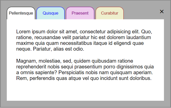
<button class = "btab btab0" onclick="showText(0)">Pellentesque</button>
<button class = "btab btab1" onclick="showText(1)">Quisque</button>
<button class = "btab btab2" onclick="showText(2)">Praesent</button>
<button class = "btab btab3" onclick="showText(3)">Curabitur</button>
<div class="tab0 tab">
<p>
Lorem ipsum dolor sit amet, consectetur adipisicing elit. Quo, ratione, recusandae velit pariatur hic est dolorem laudantium maxime quia quam necessitatibus itaque id eligendi quae neque. Pariatur, alias est odio.
</p>
<p>
Magnam, molestiae, sed, quidem quibusdam ratione reprehenderit nobis sequi praesentium porro dignissimos quia a omnis sapiente? Perspiciatis nobis nam quisquam aperiam. Rem, perferendis quas atque vel quo incidunt sunt doloribus.
</p>
</div>
<div class="tab1 tab">
<p>
Aliquam nonummy adipiscing augue. Lorem ipsum dolor sit amet, consectetuer adipiscing elit. Maecenas porttitor congue massa. Fusce posuere, magna sed pulvinar ultricies, purus lectus malesuada libero, sit amet commodo magna eros quis urna.
</p>
<p>
Nunc viverra imperdiet enim. Fusce est. Vivamus a tellus. Pellentesque habitant morbi tristique senectus et netus et malesuada fames ac turpis egestas. Proin pharetra nonummy pede. Mauris et orci.
</p>
</div>
<div class="tab2 tab">
<p>
Aenean nec lorem. In porttitor. Donec laoreet nonummy augue. Suspendisse dui purus, scelerisque at, vulputate vitae, pretium mattis, nunc. Mauris eget neque at sem venenatis eleifend.
</p>
<p>
Ut nonummy. Fusce aliquet pede non pede. Suspendisse dapibus lorem pellentesque magna. Integer nulla. Donec blandit feugiat ligula.
</p>
</div>
<div class="tab3 tab">
<p>
Ut tincidunt volutpat urna. Mauris eleifend nulla eget mauris. Sed cursus quam id felis. Curabitur posuere quam vel nibh. Cras dapibus dapibus nisl. Vestibulum quis dolor a felis congue vehicula.
</p>
<p>
Maecenas pede purus, tristique ac, tempus eget, egestas quis, mauris. Curabitur non eros. Nullam hendrerit bibendum justo. Fusce iaculis, est quis lacinia pretium, pede metus molestie lacus, at gravida wisi ante at libero.
</p>
</div>
</div>
<script>
window.onload(showText(0));
function showText(number){
var tab = document.getElementsByClassName("tab");
var i;
for (i = 0; i < tab.length; i++) {
if(i == number)
tab[i].style.display = "block";
else
tab[i].style.display = "none";
}
}
</script>
</body>
</html>