There are many excellent solutions on the Internet to produce a simple push switch such as this with varying degrees of difficulty. I have tried to keep this one to the absolute bare bones to make it as simple as possible. The code assumes some level of understanding with CSS/HTML.
Let’s get into the code: (or click here for demo)
We start off with CSS that is not part of the push button itself, but instead is part of the overall page layout.
*{
    margin: 0;
    padding: 0;
}
body{
    text-align: center;
}
h1{
    margin-top: 50px;
    color: #0000ff;
}
The code sets the default margin and padding for all elements to 0 so that we don’t have any padding or margins getting in the way of our positioning. There is an H1 title on the page that we want some spacing on the top of the title, and we want it centred. We’ve also set the H1 title to be blue. Now for the actual push button itself.
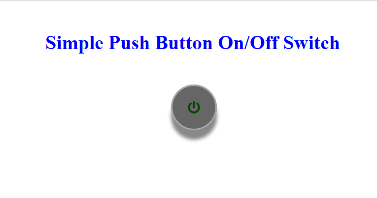
	<div class="container">
		<input type="checkbox" id="cb" class="cb"/>
		<label for="cb" class="lb"><i class="fas fa-power-off pl"></i></label>
	</div>
Once again, as we’ve seen in other posts, we have a parent container with siblings of a checkbox and a label. This is all the HTML needed for the push button. The rest of the magic is done in CSS. One point to note here is the use of a font from Font Awesome. This will be our power label. It’s simply a case of linking to the font awesome stylesheet (see full code below) and then drawing the icon with:
<i class="fas fa-power-off pl"></i>
This is the standard for the use of Font Awesome icons. Only the class changes to reflect the icon wanted. You will also notice our own class of “pl” which will be used to position and size the icon into the centre of the button. Let’s configure our container:
		.container{
			position: relative;
			width: 70px;
			height: 70px;
			left: calc(50% - 35px);
			margin-top: 50px;
		}
We set the position to be relative to the page, define a width and height, centre the button using the “calc” function and give the button some space above it to make things more aesthetically pleasing. By setting the position to relative we do three things. We allow the element to be drawn relative to the other elements on the page (as if it were Static) but can overrule the position which in our case, we specify left to be the centre of the screen minus half the width of the button. (50% + 35 px). We also restrict the positioning of the containers siblings to be within the container by using relative, so a sibling with a top of 0 and a left of 0 is positioned at the top left corner of our parent container. As with our label:
		.lb{
			position: absolute;
			left: 0;
			top: 0;
			width: 100%;
			height: 100%;
			border-radius: 50px;
			border: 2px solid #aaaaaa;
			background-color: #666666;
			box-shadow: 0 15px 8px #888888;
			cursor: pointer;
			color: #004400;
		}
The CSS here is nothing we haven’t seen before in other posts, except maybe the box shadow. This is what gives the button the effect of movement. We draw a shadow on the button and reduce that shadow when clicked. We also set our radius to be 50px which will make our button round. Width and height are set to 100% of the parent (our container) and the cursor will change to a pointer when the mouse is over the label. The rest merely specifies the colour of the button (we use the background colour), button border and the font colour which will be used by the power icon we are going to draw on top of the label. As follows:
		.pl{
			position: absolute;
			top: 23px;
			left: 23px;
			font-size: 24px;
		}
This should now be self explanatory as we already touched on what this class is for. Using absolute positioning (within our container), this CSS places our power icon in the centre of the button (the label body) and sets its font size. It is important to specify the font size as the position of the icon will change depending on the size of the font. Were you to want a larger font, for example, you would need to tweak the left and top position to centre the icon correctly.
Now to configure our checkbox:
		.cb{
			opacity: 0;
			width: 100%;
			height: 100%;
			cursor: pointer;
		}
The checkbox will be responsible for the button state but we only want the functionality of the checkbox and not the visual aspect. To hide the checkbox but keep it active we can set its opacity to zero. We also need to size it to take up the whole container, 100% width and height, as it will still detect then the mouse pointer is over the top of it, which we set to a pointer. All that’s left to do now is detect when the checkbox is checked and act accordingly:
		.cb:checked ~ .lb{
			box-shadow: 0 5px 8px #888888;
			background-color: #777777;
			border-color: #cccccc;
			color: #00dd00;
		}
When our checkbox is checked we look for our .lb sibling and change it’s style to show the action. Here we reduce the box-shadow by two thirds, change the colour of the background and border to a lighter grey, and the font colour to green. All this happens when the checkbox is checked and returns back to its previous state when the checkbox is unchecked.
That about sums it up.
FULL CODE
simplepushswitch.css
		*{
			margin: 0;
			padding: 0;
		}
		body{
			text-align: center;
		}
		h1{
			margin-top: 50px;
			color: #0000ff;
		}
		.container{
			position: relative;
			width: 70px;
			height: 70px;
			left: calc(50% - 35px);
			margin-top: 50px;
		}
		.cb{
			opacity: 0;
			width: 100%;
			height: 100%;
			cursor: pointer;
		}
		.lb{
			position: absolute;
			left: 0;
			top: 0;
			width: 100%;
			height: 100%;
			border-radius: 50px;
			border: 2px solid #aaaaaa;
			background-color: #666666;
			box-shadow: 0 15px 8px #888888;
			cursor: pointer;
			color: #004400;
		}
		.cb:checked ~ .lb{
			box-shadow: 0 5px 8px #888888;
			background-color: #777777;
			border-color: #cccccc;
			color: #00dd00;
		}
		.pl{
			position: absolute;
			top: 23px;
			left: 23px;
			font-size: 24px;
		}
simplepushswitch.html
<!doctype html>
<html lang="en">
<head>
	<meta charset="UTF-8">
	<title>Simple Push Button</title>
	<link rel="stylesheet" href="simplepushswitch.css" />
	<link rel="stylesheet" href="https://use.fontawesome.com/releases/v5.0.13/css/all.css" integrity="sha384-DNOHZ68U8hZfKXOrtjWvjxusGo9WQnrNx2sqG0tfsghAvtVlRW3tvkXWZh58N9jp" crossorigin="anonymous">
	<style>

	</style>
</head>
<body>
	<h1 id="h1">Simple Push Button On/Off Switch</h1>
	<div class="container">
		<input type="checkbox" id="cb" class="cb"/>
		<label for="cb" class="lb"><i class="fas fa-power-off pl"></i></label>
	</div>
</body>
</html>