There are many wonderful solutions to pure CSS toggle switches freely available on the Internet. However, sometimes, especially when learning CSS, you just want a simple solution that you can get your head around. CSS can and does get very involved and can become very difficult to understand so this is the simplest pure CSS toggle switch that I could come up with. The code assumes some level of understanding with CSS/HTML.
So let’s get into it. (or click here for demo)
The first piece of CSS is not actually needed as part of the toggle switch but is used to dress the page that the toggle switch is displayed on.
*{
	margin: 0;
	padding: 0;
}
.h22{
	padding: 50px;
	color: #0000ff;
}
Here we remove all default margins and padding from all elements (using *) and set the padding and colour to use on the h2 title shown above our toggle switch. The switch itself is simply a container holding a checkbox and a label.
<div class="toggleWrapper">
	<input type="checkbox" id="tg" class="tg">
	<label for="tg" class="toggle"></label>
</div>
This is the entire HTML code for the switch. The rest of the action is performed by CSS.
.toggleWrapper{
	position: relative;
	left: calc(50% - 50px);
	width: 100px;
	height: 50px;
	background-color: #aaa;
	border: 4px ridge #888;
	border-radius: 10px;
}
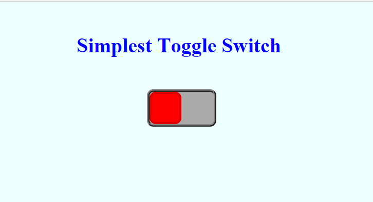
The container itself will be the body of the switch so we define it’s attributes with the above CSS. The position is set to relative which allows us to position the container relative to other elements on the page, such as the H2 title (see full code) but also specify the left position to centre the toggle switch body. We also need the position to be relative to restrict the position of the other elements to be held within the container space i.e the input and the label. The rest of the CSS above is pretty self explanatory, just width, height, and border definitions.
.toggle{
	position: absolute;
	width: 44px;
	height: 44px;
	left: 0;
	top: 0;
	cursor: pointer;
	background-color: #ff0000;
	border: 3px solid #dd0000;
	border-radius: 10px;
	transition: left .4s ease-in-out;
}
The “.toggle” will control the label and become the sliding button part of the button. The position is set to absolute so we can move the label to the top left corner of the container by specifying top 0, left 0. The button will be 44 pixels square and when a user moves over it, the cursor will change to a pointer. It’s appearance will be the background colour specified (red), as the background becomes the body of the button. The actual physical movement of the button (the slide) will run for 0.4 seconds by way of a transition. Basically, the button will stay at 0 pixels in the container until another command changes it’s left position. It will then change for one to the other in the time frame specified and the animation will ease in and then ease out.
The next part of the code configures the checkbox input.
.tg{
	opacity: 0;
	width: 100%;
	height: 100%;
	cursor: pointer;
}
We want the checkbox to be invisible but still be active. This we do by changing the opacity of the checkbox to 0. This allows it to still be clicked on and off but not seen. The size is set to be 100% of it’s parent (the container) and we want the cursor to become a pointer when the user moves over the checkbox.
The last part of the code is to configure what happens when the checkbox is checked.
.tg:checked ~ .toggle{
	left: 50px;
	background-color: #00ff00;
	border-color: #00dd00;
}
When the checkbox is checked we simply set the left position of the label to 50px, which in turn will cause the transition to happen. The background colour changes to green (so our button turns green) and the border on the button turns a deeper green.
That about sums it up.
FULL CODE
simplesttoggleswitch.css
			*{
				margin: 0;
				padding: 0;
			}
			body{
				background-color: #eeffff;
				text-align: center;
			}
			.h22{
				padding: 50px;
				color: #0000ff;
			}
			.toggleWrapper{
				position: relative;
				left: calc(50% - 50px);
				width: 100px;
				height: 50px;
				background-color: #aaa;
				border: 4px ridge #888;
				border-radius: 10px;
			}
			.toggle{
				position: absolute;
				width: 44px;
				height: 44px;
				left: 0;
				top: 0;
				cursor: pointer;
				background-color: #ff0000;
				border: 3px solid #dd0000;
				border-radius: 10px;
				transition: left .4s ease-in-out;
			}
			.tg{
				opacity: 0;
				width: 100%;
				height: 100%;
				cursor: pointer;
			}
			.tg:checked ~ .toggle{
				left: 50px;
				background-color: #00ff00;
				border-color: #00dd00;
			}
simplesttoggleswitch.html
<!doctype html>
<html lang="en">
	<head>
		<meta charset="UTF-8">
		<title>Simplest Toggle Switch</title>
		<link rel="stylesheet" href="simplesttoggleswitch.css" />
	</head>
	<body>
		<h2 class="h22">Simplest Toggle Switch</h2>
		<div class="toggleWrapper">
			<input type="checkbox" id="tg" class="tg">
			<label for="tg" class="toggle"></label>
		</div>
	</body>
</html>