One of the things that I like about CSS is that you now have the ability to create self contained pieces of code that would have once relied upon JavaScript. The code below is one such example of pure CSS working alone, with the HTML elements, to produce a tabbed dialog. The code assumes some level of understanding with CSS/HTML. If there are any points that you would like clarified please post a comment.
First we need a container to hold the code for the tabs within. This gives us greater control by giving us the opportunity to perform actions on the containers siblings, as well as style the look and feel of the container itself.
<div class="tabs">
A simple div tag is all that’s needed for a container. To this we can apply style to shape our dialog.
.tabs{
    position: relative;
    width: 500px;
    left: calc(50% - 250px);
}
Here we are positioning the container relative to it’s usual position. This does two things. It allows us to place it in the middle of the window but also acts to restrict the positioning of siblings using relative or absolute positioning. This will be required when we get to positioning the tabs. We also specify a width for the container of 500 pixels.
Next we need the HTML code for the tabs.
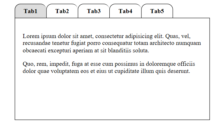
<div class="tab">
    <input type="radio" name="radio" checked class="radio" id="radio1" />
    <label for="radio1" class="label">Tab1</label>
    <div class="panel">
        <p>Lorem ipsum dolor sit amet, consectetur adipisicing elit. Quas, vel, recusandae tenetur fugiat porro consequatur totam architecto  numquam obcaecati excepturi aperiam at sit blanditiis soluta.</p>
        <p>Quo, rem, impedit, fuga at esse cum possimus in doloremque officiis dolor quae voluptatem eos et eius ut cupiditate illum quis deserunt.</p>
    </div>
</div>
Each of the tab elements are grouped in their own div tag container. Within this we have a radio button, a label and another div which holds the content for the tab. The radio button has a unique ID which allows us to tie the label to it using the “for” attribute. We only want the ability to check the radio button but don’t want to see the button itself so will hide it with CSS. The label will become the text on our tab and the content will be hidden in a div tag until the tab (radio button) is clicked. We will duplicate the group of elements for each tab that we require, all held within it’s parent div container, just changing the ID of the radio button each time. Now we can use CSS to style and control the HTML elements.
.radio{
        display: none;
}
First we hide the radio buttons as they will still be checked even when hidden.
.tab{
        float: left;
}
We want all the labels (tabs) to be grouped together on the left so we do this by floating them.
.label{
	cursor: pointer;
	padding: 10px;
	margin: 0;
	font-size: 16px;
	font-weight: bold;
	border: 1px solid #000;
	border-right-width: 0;
	border-bottom-width: 0;
	border-radius: 15px 15px 0 0;
	line-height: 15px;
	height: 15px;
	width: 60px;
	display: inline-block;
	text-align: center;
}
Most of the styling in for the label is pretty self-explanatory. We want a pointer when we move over the label (tab) with some space around the text on the tab. We specify a font and font-style and a border. We only want the border to be one pixel thick so we remove the right border line on each tab. This will leave the last tab on the right needing the right side line but we’ll attend to that in a minute. We also want a radius on the top of the border to curve the tab appearance. Next we specify a height and width for the tab size, align the text to the centre of the tab and finally instruct the browser to draw the elements inline (next to each other from left to right).
Now lets take care of the missing right border on the last tab.
.tabs div:last-child > label{
	border-right-width: 1px;
}
Here we target the label within the last div tag block (tab) in our parent container and simply draw in the missing border line. Now we can concentrate on the actual tab content.
.panel{
	display: none;
	position: absolute;
	left:0;
	border: 1px solid #000;
	padding: 20px;
	height: 220px;
	text-align: justify;
}
This is where our absolute positioning is used. We need to hide the content until the tab (radio button) is checked and the content for each tab needs to be drawn in exactly the same position, relative to its parent. So we can use “position:absolute” and “left: 0” to do this for us. Each block of text within the tab container will be rendered in the same location. All we have to do is show the correct block when the corresponding tab is clicked.
.radio:checked ~ .panel{
	display: block;
}
Here we are instructing the browser to change the display mode from none to block when the radio button is checked. The “~” is used to target the first available “.panel” class element after it, as there are five radio button and five text blocks with a class of “panel”, each contained within a “tab” div block.
Now all that’s left to do is a couple of bits of final dressing.
.label:hover {
	background: #eee;
}
.label:active {
	background: #ccc;
}
.radio:checked + label{
	background-color: #ddd;
}
We want a tab to change colour when we both hover over it (or it’s active) and when we click on it, so a grey for when we hover and a darker grey when we select a tab.
The last piece of CSS is quite important although not always necessary. Due to using absolute positioning within the document, the normal static flow of the document is compromised. This means that if we want to display something after our tabbed dialog we would struggle because the next normal document flow space would be above it. We therefore need a way to bring the starting point for rendering under our tabbed dialog. We are also floating our tabs so we need to clear that first as well.
.tabs:after{
	content: "";
	clear: both;
	height: 262px;
	display: block;
}
This we do with the above pseudo class code. We are clearing the floating element, and although we are not displaying any content with this CSS, we can still give it a height that is more than our tabbed dialog to bring the “block” pointer down below our dialog.
That about sums it up.
FULL CODE
example.css
			.panel{
				display: none;
				position: absolute;
				left:0;
				border: 1px solid #000;
				padding: 20px;
				height: 220px;
				text-align: justify;
			}
			.tabs{
				position: relative;
				width: 500px;
				left: calc(50% - 250px);
			}
			.tabs div:last-child > label{
				border-right-width: 1px;
			}
			.tab{
				float: left;
			}
			.radio{
				display: none;
			}
			.radio:checked + label{
				background-color: #ddd;
			}
			.radio:checked ~ .panel{
				display: block;
			}
			.label{
				cursor: pointer;
				padding: 10px;
				margin: 0px;
				font-size: 16px;
				font-weight: bold;
				border: 1px solid #000;
				border-right-width: 0;
				border-bottom-width: 0;
				border-radius: 15px 15px 0px 0px;
				line-height: 15px;
				height: 15px;
				width: 60px;
				display: inline-block;
				text-align: center;
			}
			.label:hover {
				background: #eee;
			}
			.label:active {
				background: #ccc;
			}
purecsstabs.html
<!doctype html>
<html lang="en">
	<head>
		<meta charset="UTF-8">
		<title>CSS Tabs</title>
		<link rel="stylesheet" href="example.css" />
	</head>
	<body>
		<div class="tabs">
			<div class="tab">
				<input type="radio" name="radio" checked class="radio" id="radio1" />
				<label for="radio1" class="label">Tab1</label>
				<div class="panel">
					<p>Lorem ipsum dolor sit amet, consectetur adipisicing elit. Quas, vel, recusandae tenetur fugiat porro consequatur totam architecto 	numquam obcaecati excepturi aperiam at sit blanditiis soluta.</p>
					<p>Quo, rem, impedit, fuga at esse cum possimus in doloremque officiis dolor quae voluptatem eos et eius ut cupiditate illum quis deserunt.</p>
				</div>
			</div>
			<div class="tab">
				<input type="radio" name="radio" class="radio" id="radio2" />
				<label for="radio2" class="label">Tab2</label>
				<div class="panel">
					<p>Reiciendis, placeat, harum magni adipisci porro quibusdam provident et sed corrupti dignissimos blanditiis aliquid nisi perspiciatis officia minus dolor a doloremque qui veritatis deserunt veniam!</p>
					<p>Id, aliquam, quo, laboriosam quos repellendus autem ex dicta perspiciatis assumenda voluptates tempora beatae mollitia aperiam doloremque tenetur! Molestiae harum facilis magni?</p>
				</div>
			</div>
			<div class="tab">
				<input type="radio" name="radio" class="radio" id="radio3" />
				<label for="radio3" class="label">Tab3</label>
				<div class="panel">
					<p>Consequuntur, cumque, dolorem natus harum dolores nulla nemo ipsam illum nihil in non necessitatibus alias omnis dolore provident aliquid reiciendis itaque voluptatum quod qui aperiam!</p>
					<p>Excepturi, aut, vero. Iusto, quaerat mollitia laudantium quia repudiandae necessitatibus incidunt unde corporis rerum aut doloribus eos sit culpa inventore nostrum modi!</p>
				</div>
			</div>
			<div class="tab">
				<input type="radio" name="radio" class="radio" id="radio4" />
				<label for="radio4" class="label">Tab4</label>
				<div class="panel">
					<p>Dolore, sunt, optio unde amet sapiente non quaerat iure quas ipsum voluptates a asperiores vel mollitia harum aperiam aliquid quasi neque dolorem fugiat perferendis quidem?</p>
					<p>Autem, esse, explicabo, aspernatur qui fuga ullam molestiae officiis sapiente labore quo ipsam sequi quaerat et sit quos in fugit iure quisquam.</p>
				</div>
			</div>
			<div class="tab">
				<input type="radio" name="radio" class="radio" id="radio5" />
				<label for="radio5" class="label">Tab5</label>
				<div class="panel">
					<p>Ipsa, debitis, nihil consequatur tempora velit ipsam quod. Veritatis, deserunt, beatae illum magni sunt dolorem ipsa recusandae voluptates error nulla tenetur tempore.</p>
					<p>Nam, magnam, neque laudantium libero rerum dolorem nostrum illum perspiciatis doloribus itaque magni fuga dolor inventore beatae ab. Labore nihil veritatis dolores!</p>
				</div>
			</div>
		</div>
	</body>
</html>
Click Here For Demo or Download Code Here
Special thanks to codecourse.com for many of the techniques used in this code.